A Multidisciplinary Practice
in Graphic and Brand Identity Design
Email︎︎︎
Instagram︎︎︎
JP
+81 070 2013 1480
AK
+1 907 331 6489
Room 307
1-32-3 Uehara, Shibuya
Tokyo 151-0064 JP
︎︎︎ Request Full Portfolio
![]()
in Graphic and Brand Identity Design
Email︎︎︎
Instagram︎︎︎
JP
+81 070 2013 1480
AK
+1 907 331 6489
Room 307
1-32-3 Uehara, Shibuya
Tokyo 151-0064 JP
︎︎︎ Request Full Portfolio

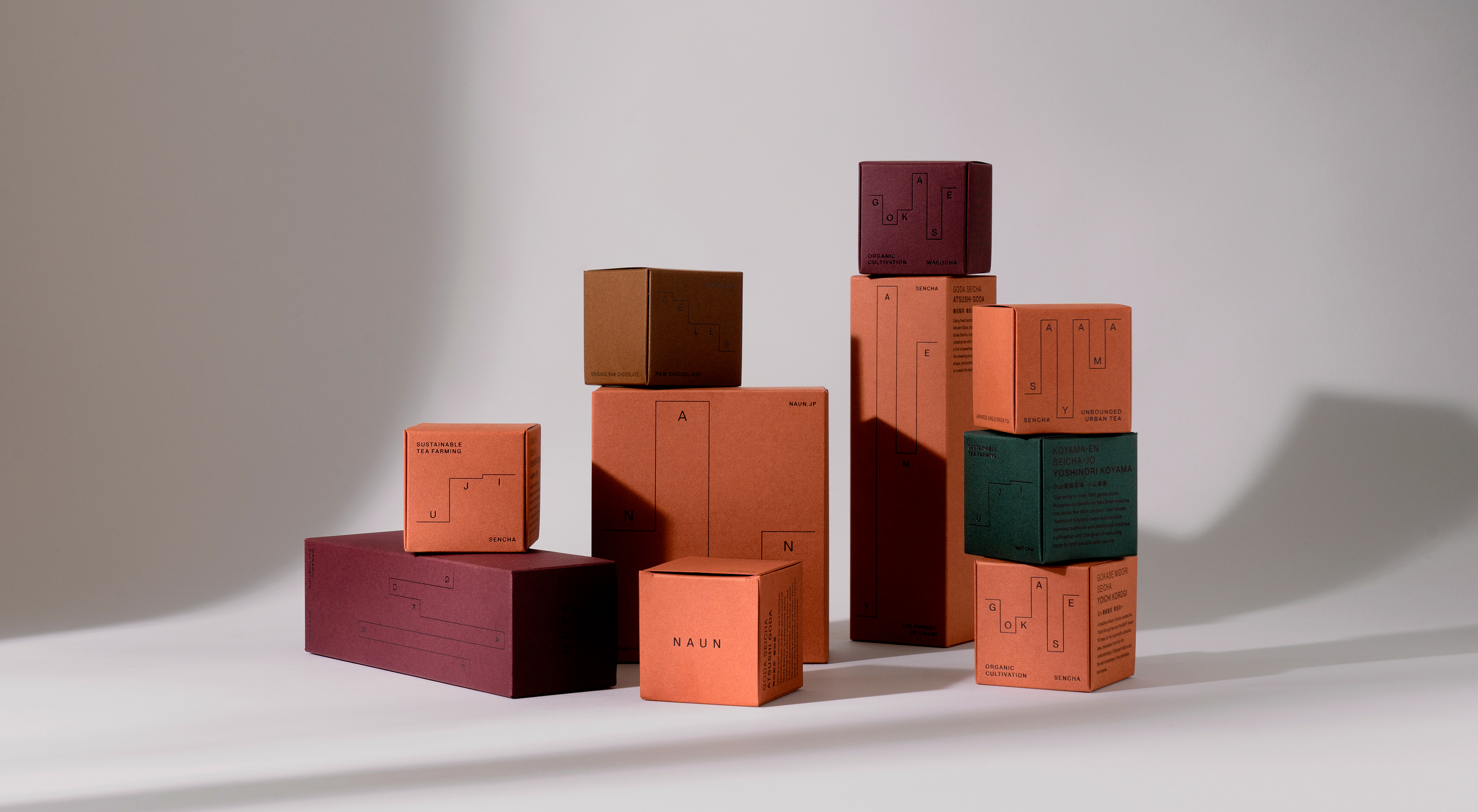
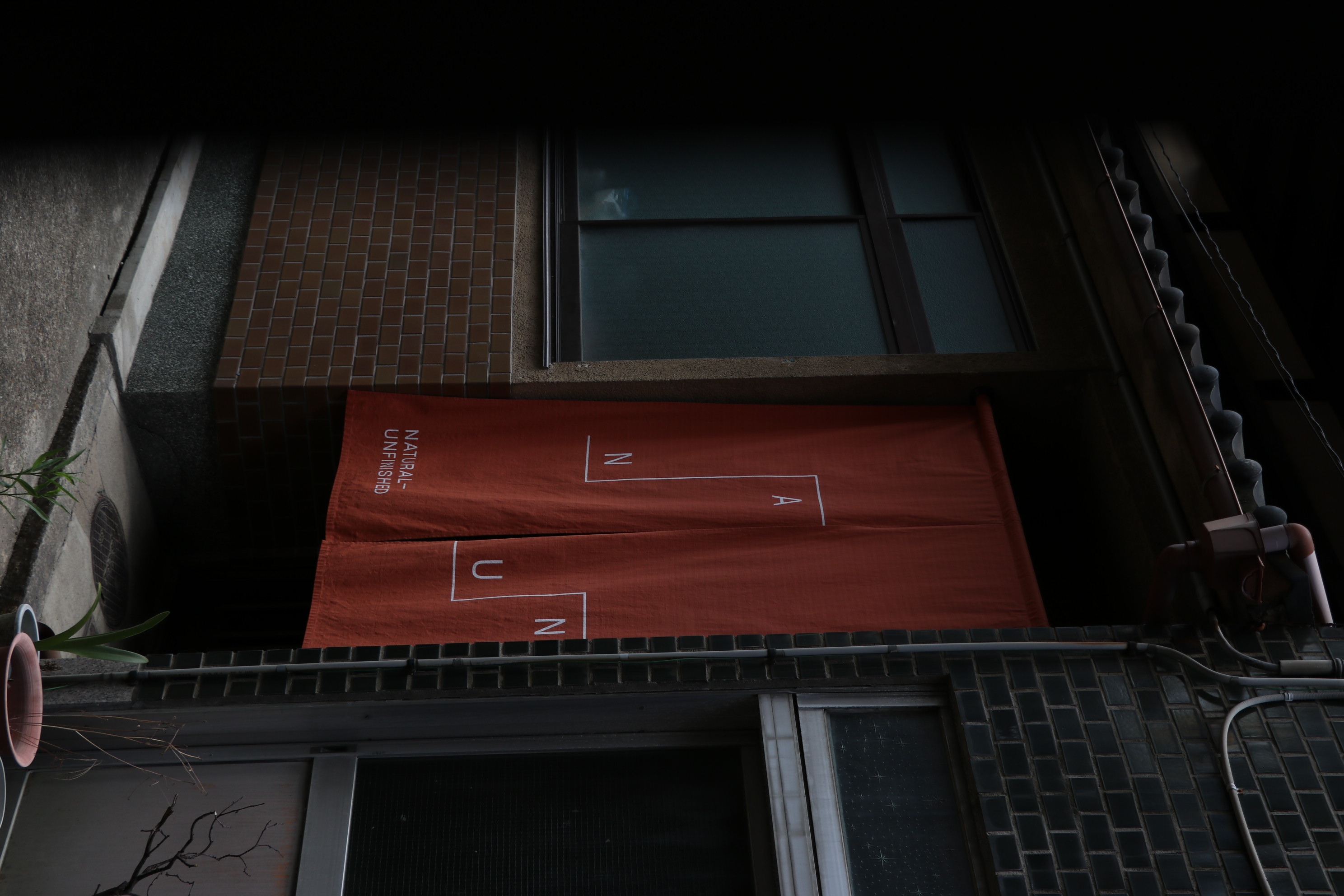
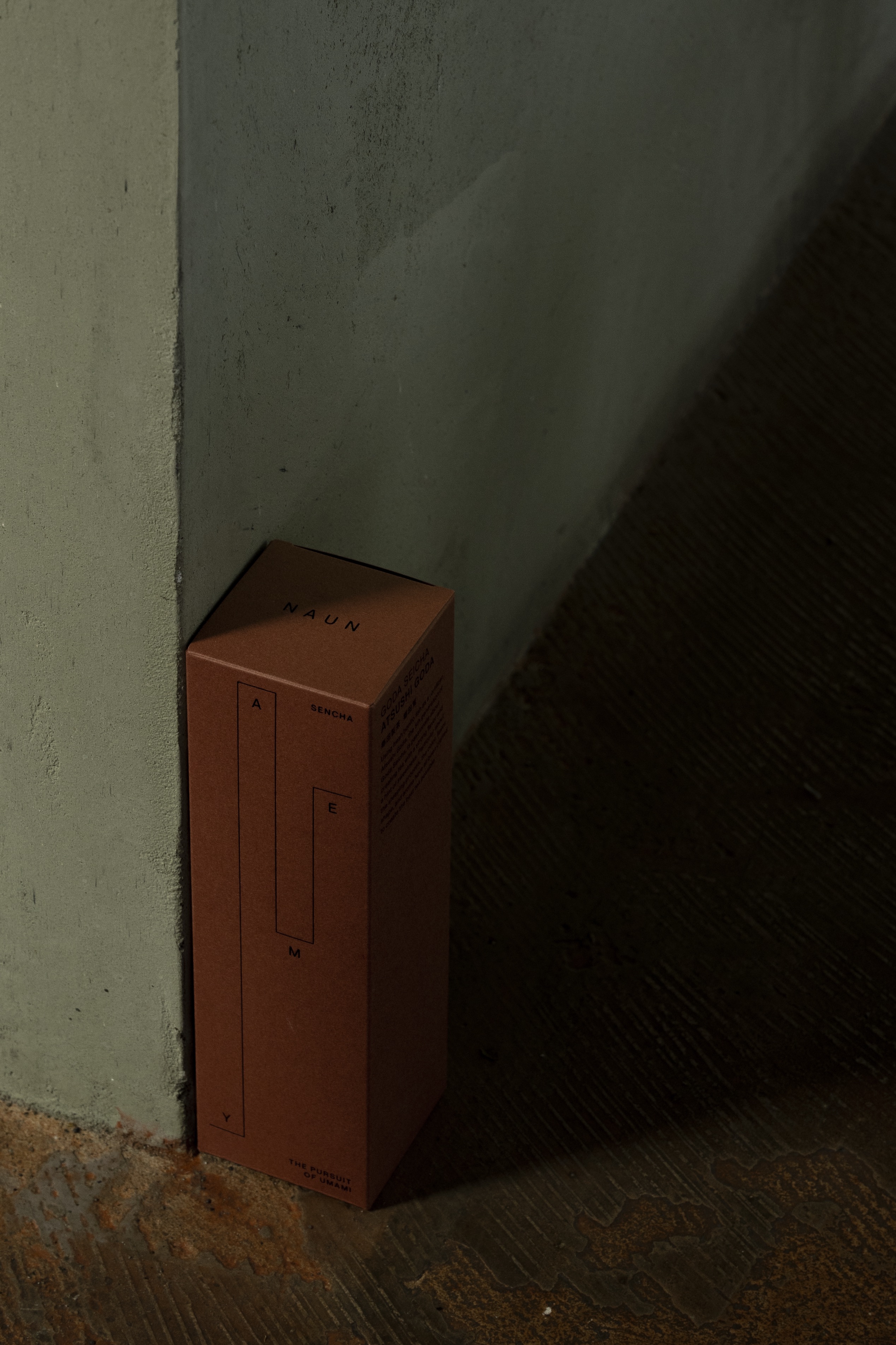
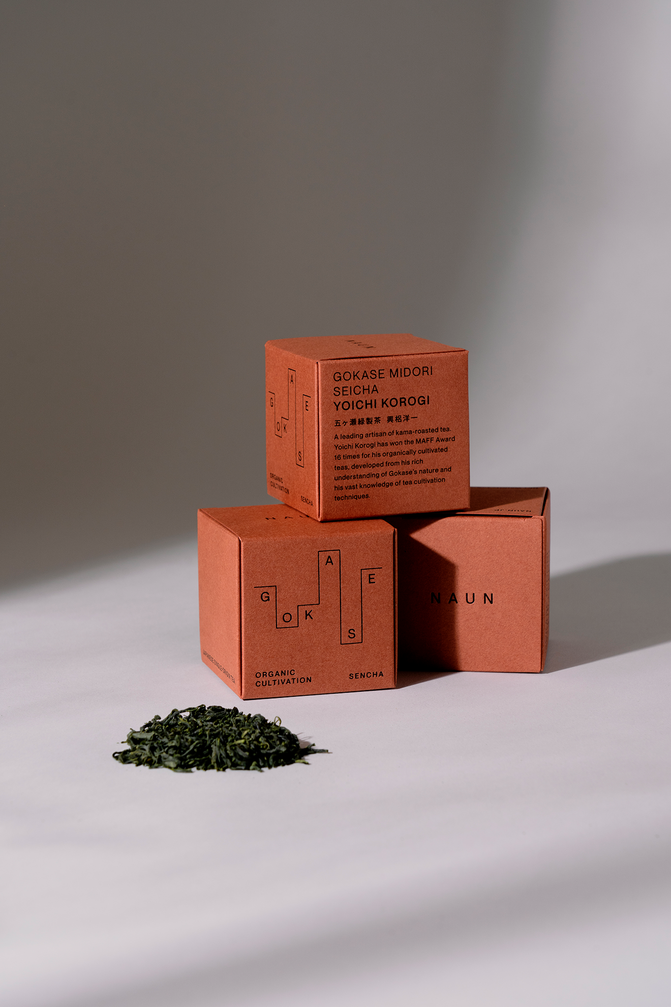
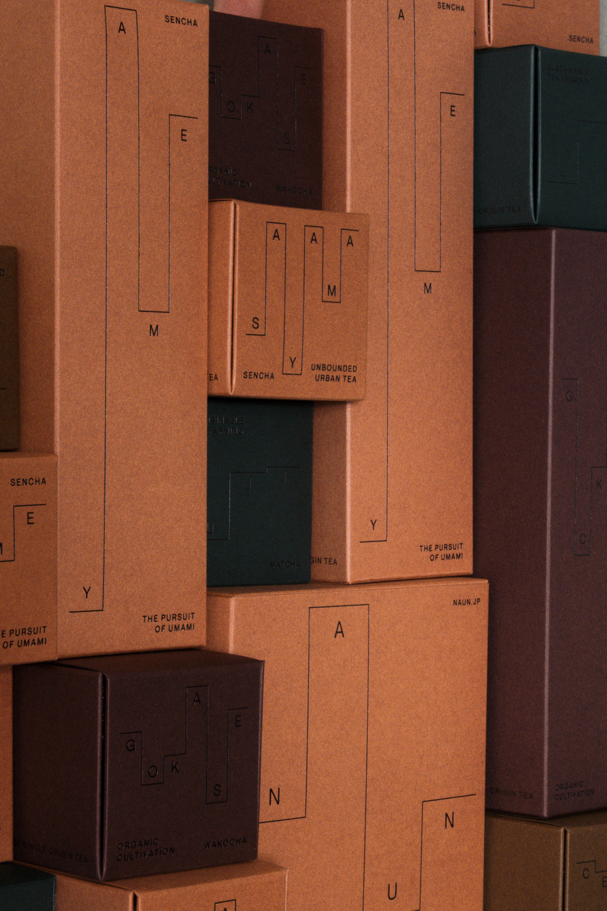
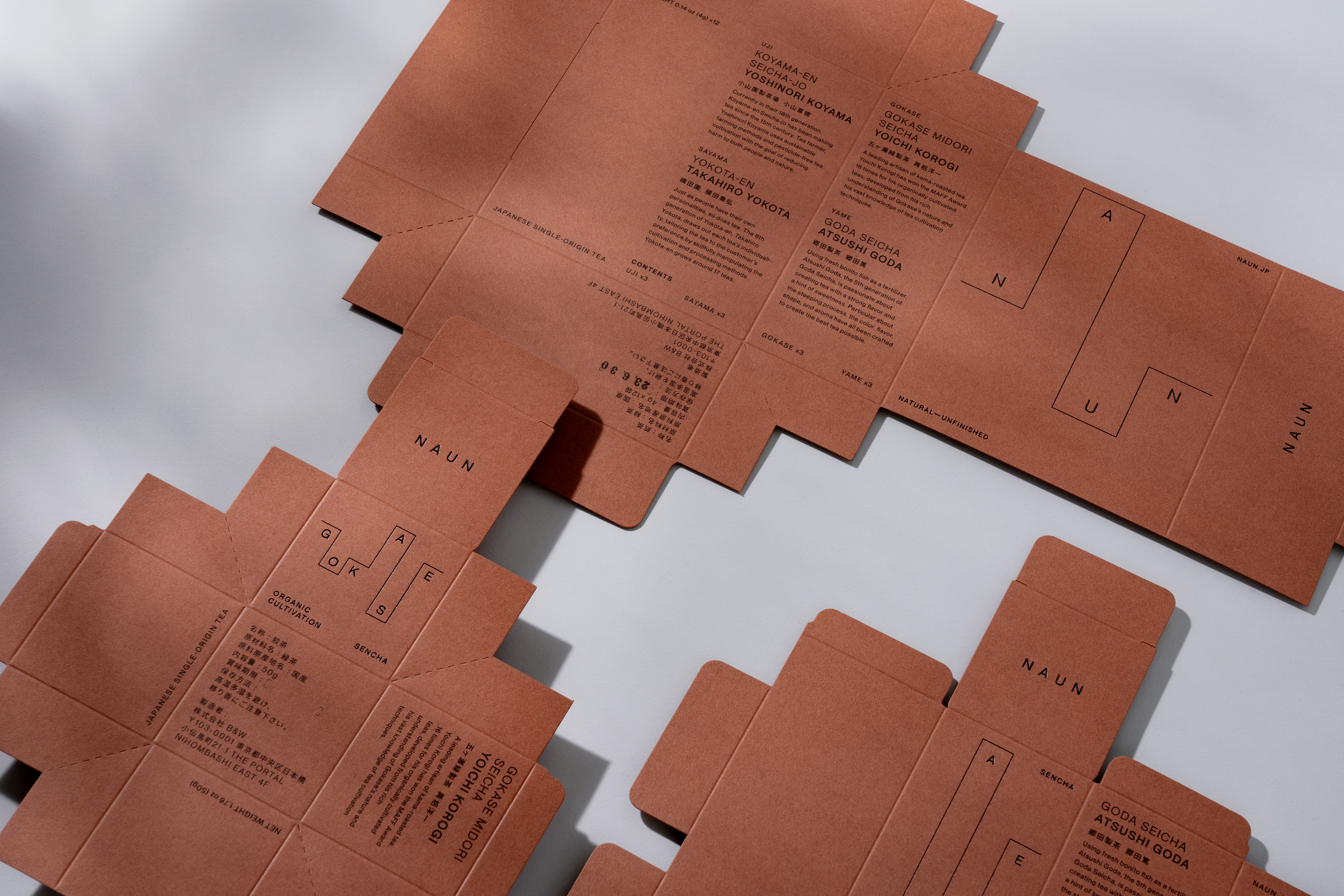
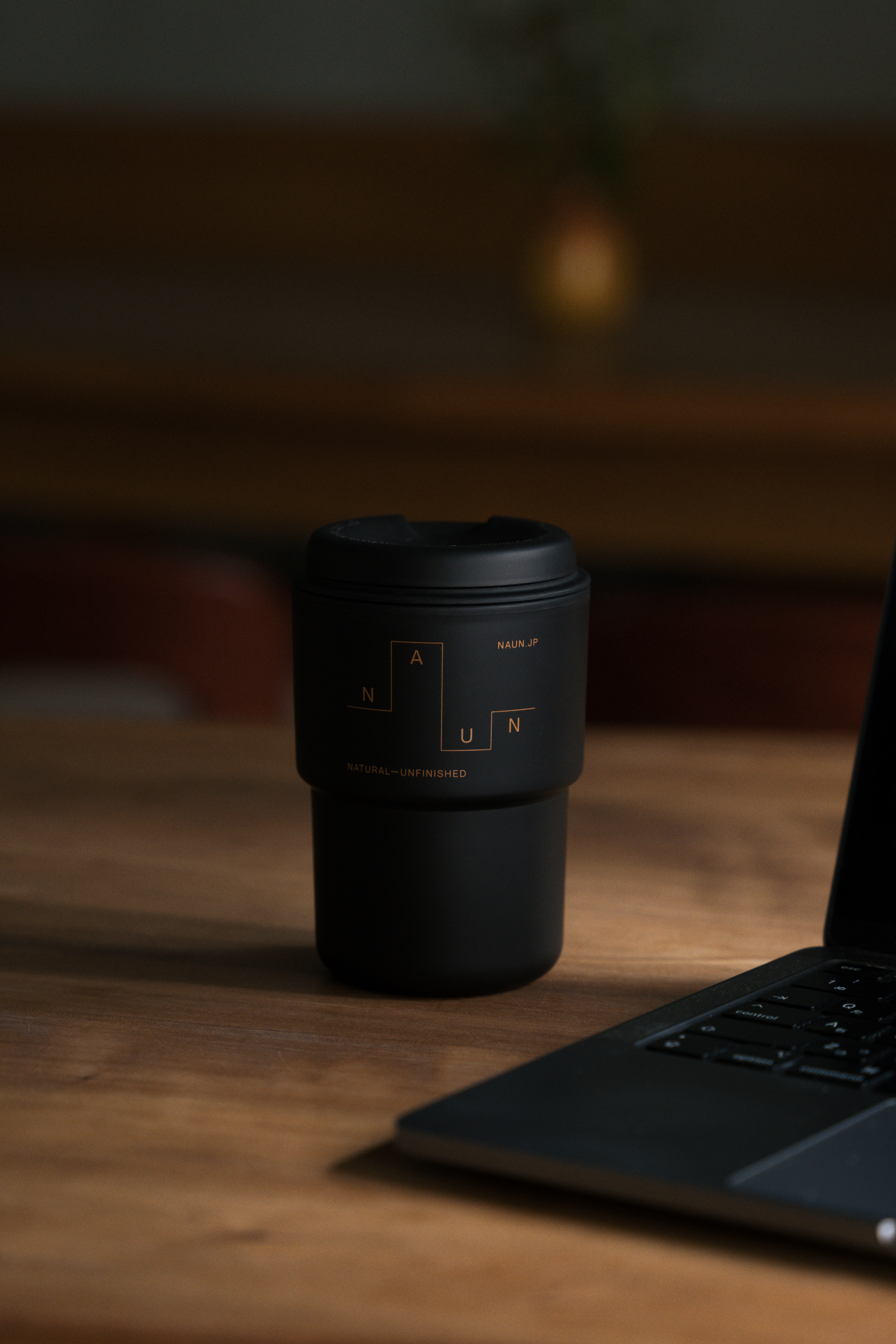
A wellness brand with a focus on single-origin Japanese tea. We worked closely with the client to create a visual identity defined by nature and time. We were in charge of the Naming and Visual Identity encompassing the logo design, package design, stationary design, signage design, web design, and social media design.
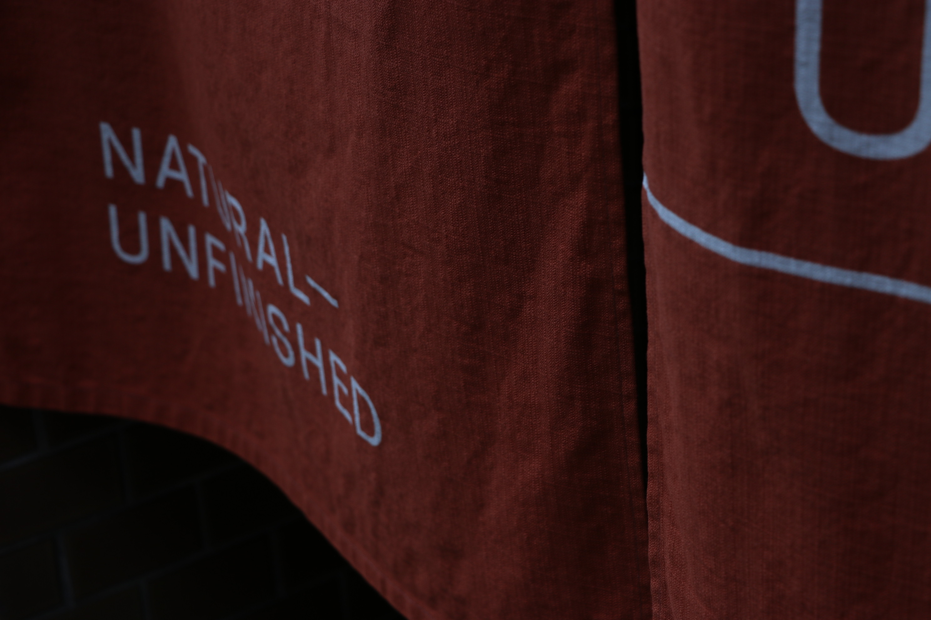
The deep amber represents the subtle hues of dusk and dawn—when time is at its most impermanent. This led us to use amber red GA board FS paper and other colors in the lineup to represent the different types of tea and products. The typographic system is based on an A to Z grid where the name dictates the placement of the letters.
The deep amber represents the subtle hues of dusk and dawn—when time is at its most impermanent. This led us to use amber red GA board FS paper and other colors in the lineup to represent the different types of tea and products. The typographic system is based on an A to Z grid where the name dictates the placement of the letters.
日本茶を中心としたウェルネスブランド。クライアントと密接に連携し、自然と時間に定義されたビジュアル・アイデンティティを構築しました。ロゴデザイン、パッケージデザイン、ステーショナリーデザイン、サインデザイン、ウェブデザイン、ソーシャルメディアデザインを含む、ネーミングとビジュアルアイデンティティを担当しました。
深みのあるアンバーは、夕暮れや夜明けの微妙な色合いを表現しており、時間が最も無常であることを表しています。そのため、琥珀色のGAボードFSペーパーや他の色をラインナップに使い、お茶の種類や商品の違いを表現しています。タイポグラフィは、AtoZのグリッドを基本とし、名前によって文字の配置を決めています。


Client:
B&W holdings / K.K. KiNG
Web Development:
Adrien Dufond
Producer:
K.K. KiNG
Scenery Videography:
joylous_Tokyo
Product Photography:
Yu Kawakami
Photography:
Takumi Isobe